The story behind the IMEX brand refresh: a journey of innovation and collaboration
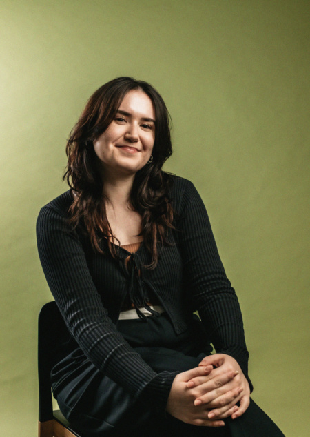
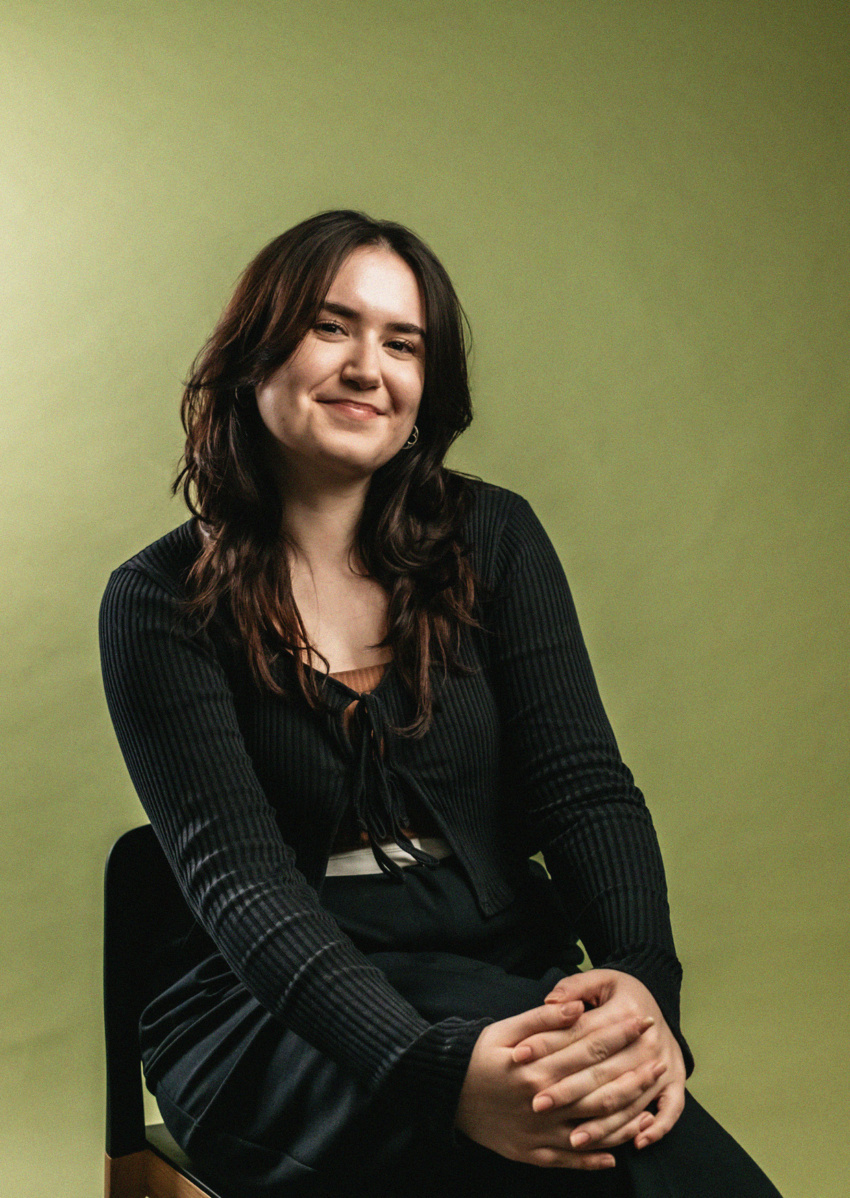
An interview with IMEX's Design Manager, Anna Gyseman
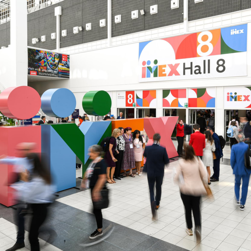
IMEX Frankfurt 2023 saw the unveiling of our brand refresh. A sassy, colorful breath of life that paid homage to our heritage. With a brand created more than 20 years’ ago, we were ready to streamline our visual identity to better reflect our shows and our company. At the start of 2022, our talented in-house Design Team, led by Head of Design, Anna Gyseman, embarked on a project to reimagine IMEX’s image. An updated, but true to our roots, incarnation of the IMEX brand.
Anna explains, “The new IMEX identity nods to our heritage, as it looks to our future: enduringly solid, but sharper and sassier. It’s more than a pretty badge and a nifty design, it’s our tone of voice and how we present ourselves to the world.” Our Content Producer, Charley Murfitt, and Anna chatted through the process, intentions and collaborative effort of our brand refresh.
What was the first step of the brand refresh and how did this shape the path you took?
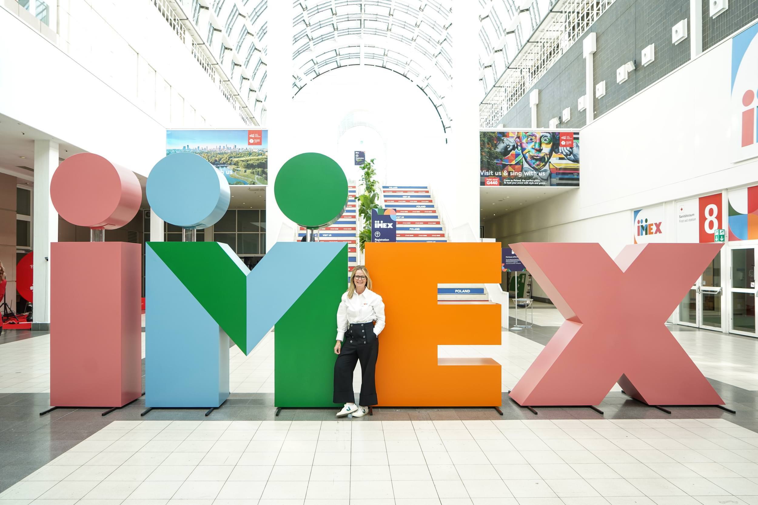
We contacted exhibitors and partners for an insight into their relationship with our brand alongside a team of honest critics comprising of Anna’s ex-colleagues, creative directors Tony Chambers, Suzanne Sykes and Jonathon Clayton Jones. We realized people felt strongly about elements such as the dots arcing above our original logo, so we needed to keep them.
The dots went on to shape everything. They represent our attendees coming together. Our design mantra became “don’t forget the dots”, as they evolved into a visual representation of the positive power of meeting face to face.
What were your initial plans and objectives for the brand, did they change over time?
I wouldn’t say the plans changed but they did evolve. The brand has to work across so many platforms.
At the forefront of the design process was the intention not to alienate our existing audience. It was a refresh, not a rebrand. And we wanted to make it inclusive.
Successful brands aren’t built in one project. Ours was built by the countless small decisions made every day by the people in our company.
We wanted to better represent our shows, and our mission, vision and purpose in a visual way. And modernize our identity, in step with our ongoing digital transformation, as well as our content and creative endeavors across all our channels.
How did you collaborate with other members of the IMEX team?
The Marcomms team’s input was invaluable to the launch’s success. The tireless work of our brand refresh team gave us the freedom to be creative, knowing that the scaffolding was around us. Unknown talents came to the front. It’s easy to get too close to a project. So, it was a gift to keep checking our rearview mirror, knowing we could get honest feedback.
Watch IMEX’s collaboration with Buff Motion: hero animation
What was the reaction to the new identity when it launched at IMEX Frankfurt, and did it make you want to change anything in hindsight?
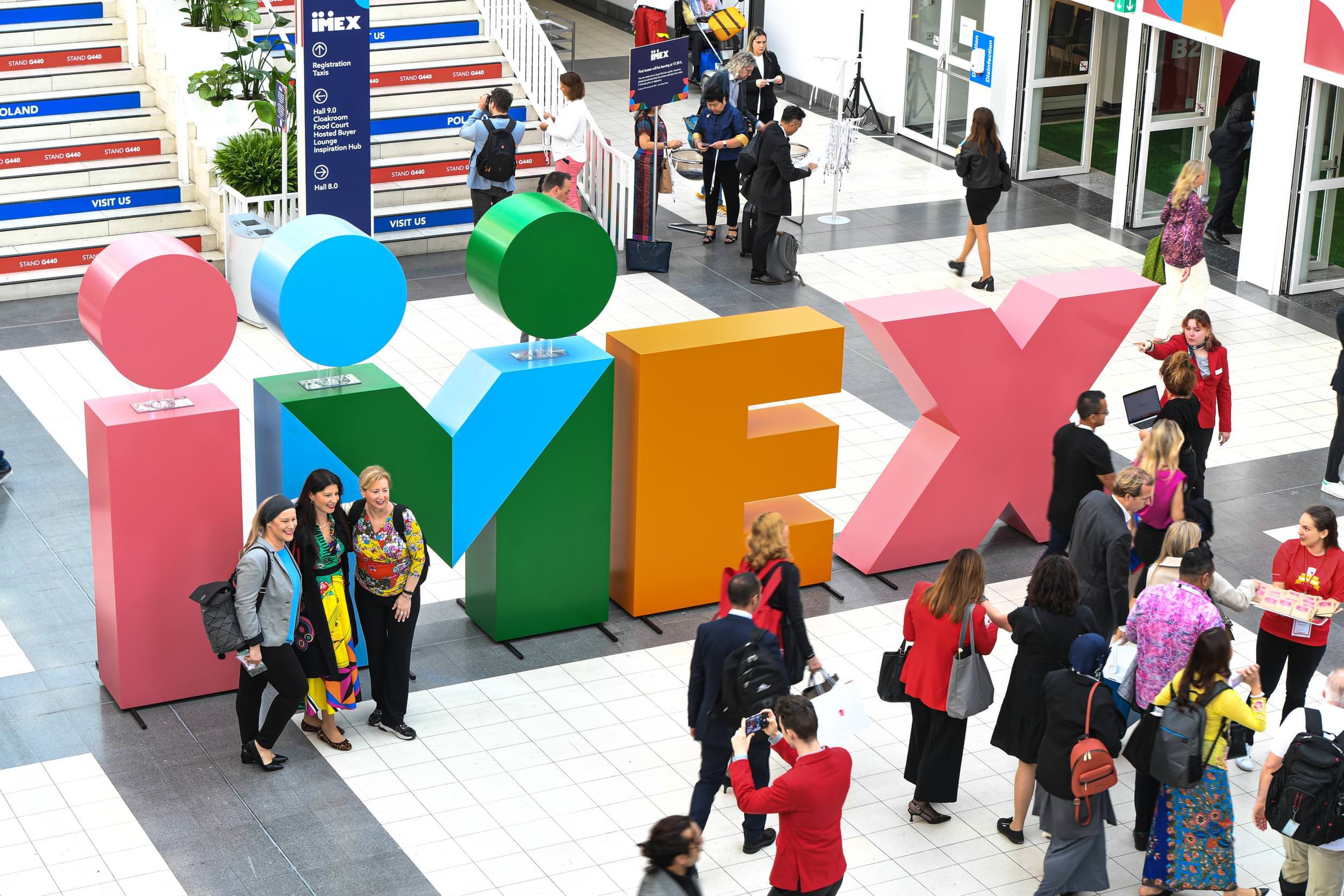
We had so much positive feedback at the show.
We were quite restrained about only using the core colors in Frankfurt. We were conscious of getting the refreshed brand into people’s minds as fast as possible. In hindsight, I would’ve been more playful. But we have so many more opportunities to showcase it. Watch this space.
Do you have any advice for other companies wanting to shake up their brand?
Do your research and know your audience. Don’t just design for design’s sake or change for change’s sake. You can do something special with intention–I truly believe good design can work anywhere.
